
Home Technology Software Mapping Software for Customer ...
CIO Bulletin
,
08 July, 2026
Author:
Gayathri Sr
You pull the churn report for last quarter. The number reads 8%, about the same as the quarter before, and it would be easy to file that under stable and move on. Underneath that flat 8% is a metro losing customers at 20% while three other regions hold near 4%, and the retention budget you are about to spread evenly will overspend on the regions that are fine and starve the one that is bleeding.
Churn is almost never uniform. It concentrates, and it concentrates by place. A competitor opens in one city, a delivery partner fails in one county, a price change falls hardest on one income bracket that happens to cluster in one suburb. Each of these leaves a regional fingerprint, and none of them appears in a company-wide percentage. The pattern only becomes legible when the losses are put on a map.
A single churn rate blends very different places into one figure. The national 8% can be a 20% metro stitched to several calm 4% regions, and a plan built on the 8% is wrong for every one of them. Acting on the 8% means treating a crisis and a healthy market with the same playbook, which wastes money on both.
The cost of getting this wrong is large. Churn drains an estimated $168 billion a year from U.S. providers, and acquiring a replacement customer runs 5 to 25 times the cost of keeping the one who left. A 5% cut in churn can raise profit by 25% to 95% depending on the sector.
Those gains are not spread evenly. Retail loses buyers at roughly 37% a year and hospitality closer to 45%, so in high-churn businesses the regions that leak fastest are where the money is. Those returns come from fixing the specific places churn concentrates, which a uniform retention spend never touches.
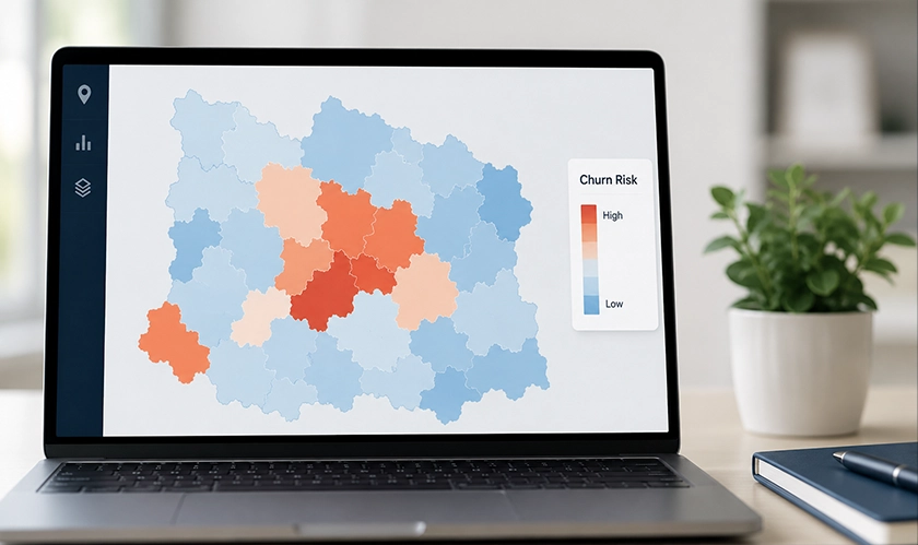
The fix starts with one view. Software that can map my customers and shade each point by retention turns the blended number into a picture, where the metro bleeding at 20% lights up red against regions holding steady. A team stops guessing where the losses are and reads them off the screen.
Resolution matters here. Churn measured down to the ZIP code reveals patterns a state-level or national number erases, and the finer the grid, the sooner a cluster shows up. A loss rate that looks like normal variation at the national level is often a sharp, contained problem once the map narrows to the neighborhoods where it is actually happening.
A cluster on the map is a question, and the region usually answers it. The churn rate tends to break down by geography in ways that point straight at the cause. Urban losses often trace to price competition, where rivals cluster and switching is easy. Suburban losses more often come from service quality, and rural losses frequently trace to poor coverage or slow delivery. The same map that shows where customers are leaving narrows down why.
Competitor movement is the loudest regional signal. When a rival opens in a metro and losses in that metro climb the next quarter, the two facts on the same map make the connection obvious. A company-wide report would blend that spike into the national average and miss the event entirely, along with the chance to respond before the damage spreads to nearby markets.
Not every regional pattern means the same thing, so the shape of the cluster carries information. Regional attrition that follows a competitor's new stores points to a pricing or feature gap. Loss that tracks the edge of a service area points to coverage. Loss concentrated in one income tier that happens to cluster in one set of neighborhoods points to a price change that landed too hard on that group. Each pattern suggests a different fix, and a flat number suggests none.
The map proves its value here, inside a retention program. It converts an alarming total into a set of specific, located problems, each with a likely cause a team can test. A retention manager who knows the losses are concentrated in three ZIP codes near a new competitor has a plan. One who knows only that churn rose two points has a worry.
Retention money works harder when it is aimed. A win-back offer built for a region losing customers to price can lead with price, while a region losing customers to slow delivery gets a service message instead, and the same budget produces more saves because each message matches the reason people actually left. A win-back program built this way is a segmented, multi-touch effort, not one national offer mailed to every lost account.
The map also shows where retention spend should not go. Regions holding steady do not need a discount campaign, and pulling budget away from them to fund the bleeding metro is exactly what finding the pattern is for. Aimed retention beats blanket retention because the money follows the need instead of the ground the company already covers.
Churn on a map is a diagnosis, plain and simple. The national rate tells a company that it is losing customers. The map tells it where, and where is most of the way to why. A retention team that works from a shaded map of its losses spends its budget on the metros and neighborhoods that are actually failing, tests a cause it can name, and measures the result region by region. Retention is loyalty rebuilt one region at a time, and a team that reads only a single blended percentage cannot see the neighborhoods where that loyalty is slipping. One approach keeps customers the other one loses, and the difference is one map, drawn before the budget was spent.





















































 consultants ltd.jpg)


Comments