
Home Industry Food and beverage Why Is the Coca-Cola Brand Ref...
CIO Bulletin
,
22 July, 2026
Author:
Ravathi Sunil
Unveiling a unified visual refresh across global markets to reinforce consumer trust and protect long-term growth.
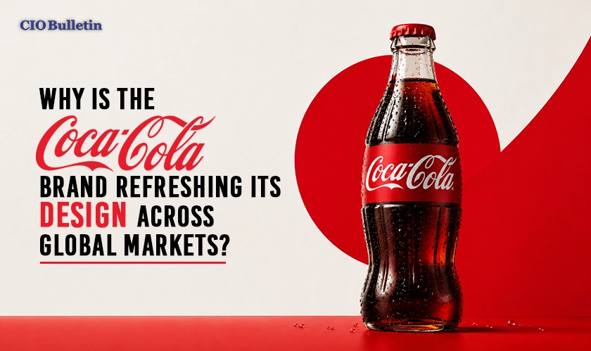
The beverage giant has unveiled a comprehensive visual refresh across more than 200 global markets to sharpen its presence. The strategic move amplifies core Coca-Cola brand assets like the Spencerian script, Dynamic Ribbon, Arden Square, and signature red-and-white palette across packaging, retail spaces, and digital platforms. Given the changing consumer behavior and fragmented digital channels, the effort is geared towards making each and every execution identifiable without fail.
Why would one of the most recognized companies on Earth redesign its visual identity system? As noted in a recent CIO Bulletin analysis, operating over decades across hundreds of countries can allow minor inconsistencies in local marketing to cause the physical product to drift away from the mental image held by consumers. Re-aligning these distinct visual cues across physical and digital environments protects long-term pricing power while optimizing marketing efficiency as competition intensifies.
"When you're 140 years old, operating across every market and every touchpoint, small inconsistencies creep in," stated Tosh Hall, Global Chief Creative Officer at JKR, the design agency behind the global refresh.
In addition, the new system introduces a distinct visual identity for Zero Sugar that includes bold typography, prominent black ribbons on the cans, and black caps for PET bottles. In order to maintain consistency in design across different regional stores, PepsiCo has introduced digital resources and a brand center to its designers and agencies.
Key Insights from the Research:
Core visual assets like the Dynamic Ribbon and Spencerian script receive greater prominence globally.
Specialized design treatments highlight zero sugar products to match shifting consumer health preferences.
Advanced digital design governance tools support seamless visual execution across more than 200 markets.
By delivering one unified brand experience everywhere, this strategic evolution ensures the company extracts maximum value from its iconic global equity.
Everything you need to know about this news
The redesign eliminates small visual inconsistencies across global markets to ensure a single, recognizable brand experience.
The updated look features the Spencerian script, Dynamic Ribbon, Arden Square, and classic red-and-white color palette.
Zero Sugar packages now feature larger product text, a bold black ribbon on cans, and black bottle caps.
Internal teams and agency partners are using specialized design intelligence tools and a brand center for governance.
Consistent visuals protect long-term pricing power and maximize marketing efficiency in a highly competitive market.














































 consultants ltd.jpg)


Comments